In 2010, Mattel, Inc. launched their partnership with World Wrestling Entertainment with a wide array of toy-based consumer products including action figures, replica role play items, wrestling rings, championship belts and more...
I led the creative development and package branding from concept to completion while working with an elite team of graphic designers, structural engineers and copywriters.
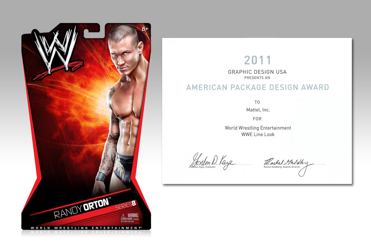
We handled the majority of the initial development in-house and for our efforts we're rewarded with GRAPHIC DESIGN USA's PACKAGE DESIGN AWARD!
The key elements of the branding include the use of WWE's signature colors (Red, Black, White), large Superstar artwork, and the chevron-shaped side angles that helped our line look stand out against the competition at retail.
But as we all know, toy packaging constantly changes from season to season so we were back at it again in 2012...
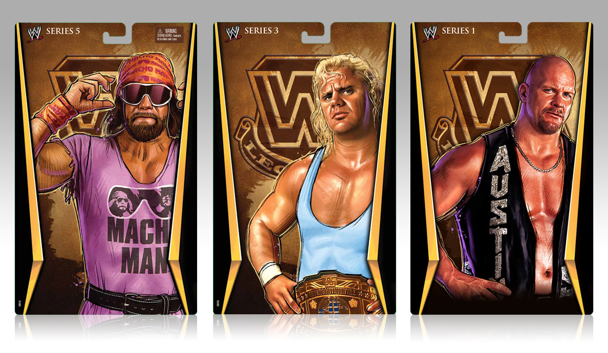
External illustration credit: David Selvadurai (bluelinedesignstudio.com)
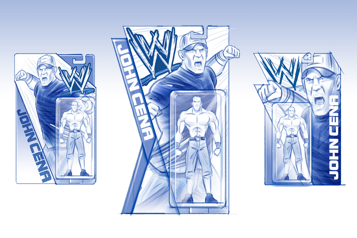
The strategy for 2012 was simple:
• Bigger & Badder Superstar images
• Bold Superstar names
• New color palette
Here are the 3 concepts that we presented to WWE. The center image was our recommendation.
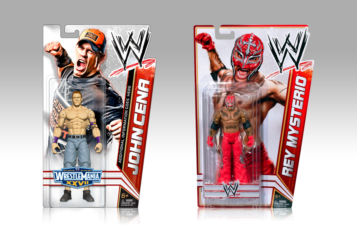
Left – revised design Right – final packaging
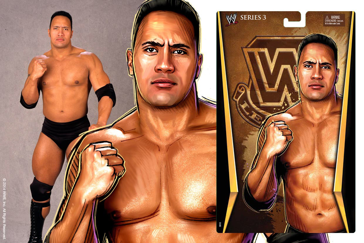
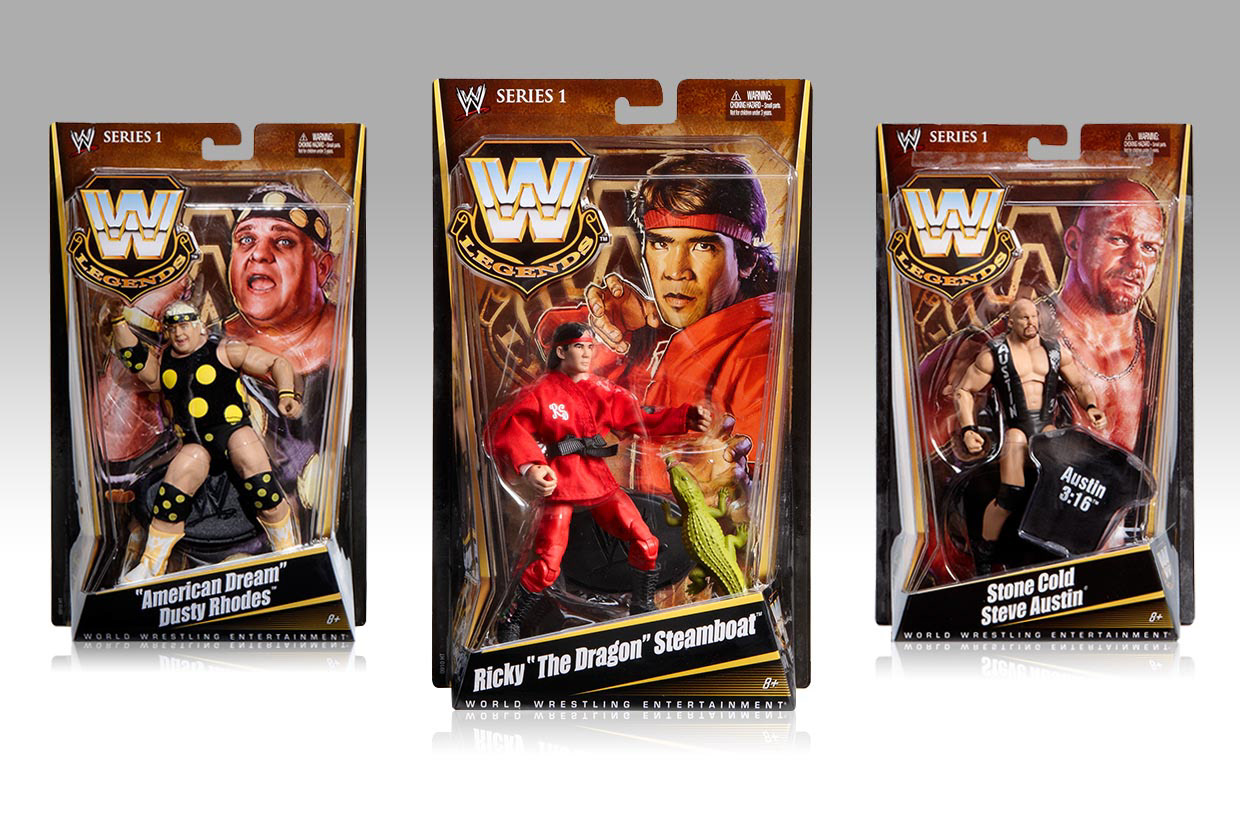
I wanted the WWE Legends to be illustrated in 1980's movie poster style art inspired by Drew Struzan
External illustration credit: Pilot (pilotagency.com)
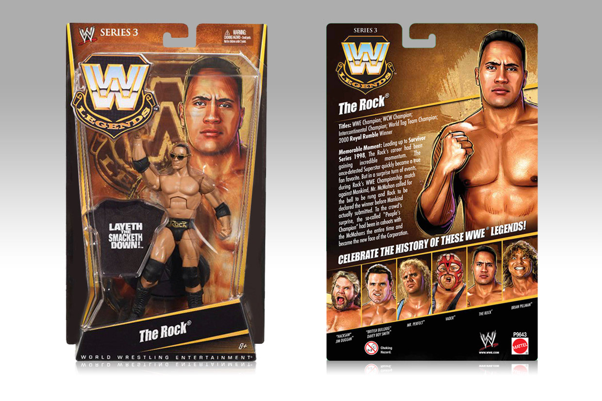
External illustration credit: Pilot (pilotagency.com)